UX or User Experience is one of the most important aspect of a website. It affects conversion, usability, and the overall experience of users. This is especially important when the user is a first time visitor. But, how do we design with UX in mind? What steps should we take in order for us, designers, create a pleasant experience for our users? In this article, I’ll talk about the 5 steps of how I usually design websites for High6 clients.
1. Business Research
First of all, it is extremely critical to know what’s the project and to whom it is for. Start with getting to know your client’s business information, specially the industry they are in. Things like brand, reputation, business model, competitors, culture and goals should be on your list of research. This will help you a lot later on when you’re generating ideas, which we’ll talk about later.
2. User Research
Users or your client’s customers, consumers or clientele, whatever it is. Studying your target audience is as much as important as the Business Research. This is where I collect information about their needs and wants (i.e. take note that these are two different things), age, role in the community, gender, technical level etc. You should gather as much information as you can at this stage. After gathering the data, develop personas and ideal scenarios of how the users will interact with the website or perform some tasks.
3. Content Ideation and UX
If your client has an old website, look for things in their site that you find useful or that works well and plan how you will reuse those contents for the new site. Also, remove the unneeded parts and combine the things that should not stand alone on a single page, so you can save more space for other important things. Furthermore, brainstorm of ideas, functionalities or additional content for the new site using the research you’ve done in step 1 and 2.
4. Wireframing
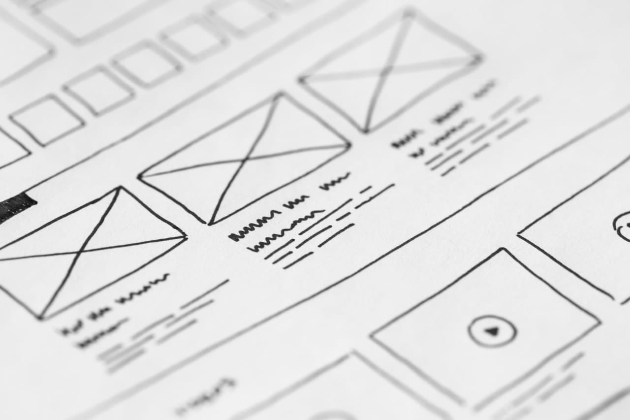
Build prototypes of the website combining all the information and ideas you’ve formed with step 1 to 3. Here, we need to determine what content and functionalities should be on each page and how each page will lead to another page. Aesthetics is not important here yet so focus more with the layout and structure of the site, but it will also help if you can imagine some bits of how it will look like on the end result. After creating the wireframes, gather feedbacks from other people by showing and explaining them your wireframes, they may be your team mates, users, or clients. The purpose is to test if the structure works well base on their expressions, opinions or any other form of feedbacks.
5. Hi-Fi Designs
Finally, create High Fidelity Designs with your favorite design tool, mine is Adobe Photoshop. If you’re working within a team, ask for their ideas and collaborate. Chances are, you’ll generate more awesome ideas together that what you have before this step. Pick the right colors that will greatly express the goals, services or brand of your client. Typography will come into play in here too, so be sure that you mix all design aspects with it with harmony and consistency. Once the designs are done, get feedbacks as early as possible with other people so you can improve it more. As long as you feel that there is something wrong, work on it and iterate as much as you can till that feeling gets right.
Conclusion
This is how I usually design the websites I created. However, I’m looking for more ideas and still learning more everyday so I can improve it more. Especially now, with the Rise of Virtual Reality, things will be more interesting in the future. I hope that you have learned something from here and expect that more articles will come soon!


